Wikipedia:Featured picture candidates/James Dobson
Appearance
Voting period is over. Please don't add any new votes. Voting period ends on 21 Jun 2013 at 03:28:19 (UTC)


- Reason
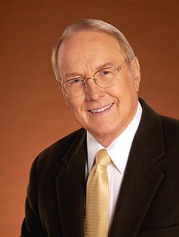
- Good image, good quality, good resolution
- Articles in which this image appears
- Christian scholarship, James Dobson
- FP category for this image
- Wikipedia:Featured pictures/People/Others
- Creator
- Focus on the Family
- Support as nominator --Mediran (t • c) 03:28, 12 June 2013 (UTC)
- Oppose Top left corner missing image, something funky happening at the left-side bottom edge. Not sure what's with the dim halo behind his shoulders. Also, very strange composition, almost like the photographer was turning away when someone called "lunch" as he was pressing the shutter; I would normally support a crop, but I think too much of his left shoulder (frame right) is missing; unfortunate. – Kerαunoςcopia◁galaxies 05:03, 12 June 2013 (UTC)
- Support. Clear picture. I think the composition is intentional. TCO (talk) 14:19, 12 June 2013 (UTC)
- That still doesn't forgive the glitchy bottom edge and top left corner. – Kerαunoςcopia◁galaxies 14:51, 12 June 2013 (UTC)
- Comment Added an Alt. Cropped out the weird edging via rotation (it looked to me like at some point in its life the image got spun around), took a little off the left side to balance it out. Cowtowner (talk) 16:07, 12 June 2013 (UTC)
- Did you add an sRGB color profile? Your edit seems slightly darker (and therefore more red) to me. Tag you're it :) – Kerαunoςcopia◁galaxies 17:31, 12 June 2013 (UTC)
- I saved two versions, one that kept the original profile, and one that I saved with no profile at all. I spent a lot of time flipping between the two trying to determine if I was crazy for thinking it looked minutely different. I honestly can't say for sure (there is slight change in the face between the two?); part of me wants to believe it's an optical illusion because of the slightly-new position of the background gradient. Cowtowner (talk) 17:38, 12 June 2013 (UTC)
- No, there's a definite shift in color (for me, and I would not consider that reliable at this moment, so hopefully a third party will step in) between File:James Dobson 2noprofile.jpg and File:James Dobson 2.jpg, and no color shift between File:James Dobson 2noprofile.jpg and File:James Dobson 1.jpg.
However, between the last two, it looks like they are two different images—instead of a normal two-dimensional rotation, the rotation almost appears three-dimensional. Did you find a different photograph? The coat and tie shift and there's more spacing between them.– Kerαunoςcopia◁galaxies 17:45, 12 June 2013 (UTC)
- Nevermind, talk about an optical illusion. The rotation is just a regular rotation it appears. – Kerαunoςcopia◁galaxies 17:47, 12 June 2013 (UTC)
- Looking again, you're right. The no profile one is oranger and the same as the original; the one with the profile added appears to be slightly more flesh-coloured. Oddly, I think it actually looks more natural (happy coincidence?). So, I'm not sure which one others will prefer. And the loss of the edge of the pocket did give the impression of a perspective correction (and left me saying to myself "I know I didn't do that, but I don't think I'm crazy "). Cowtowner (talk) 18:00, 12 June 2013 (UTC)
- No, there's a definite shift in color (for me, and I would not consider that reliable at this moment, so hopefully a third party will step in) between File:James Dobson 2noprofile.jpg and File:James Dobson 2.jpg, and no color shift between File:James Dobson 2noprofile.jpg and File:James Dobson 1.jpg.
- Also, to clarify, I uploaded an alt, but I'm not going to support this. I find this man deplorable. Cowtowner (talk) 18:01, 12 June 2013 (UTC)
- Oppose Looks like a Dulux "terracotta tones" test card, complexion included. And whilst it is entirely incidental, I happen to entirely agree with Cowtowner's addendum just above. Plutonium27 (talk) 01:06, 16 June 2013 (UTC)
- Oppose Ultra standard common portrait, dime a dozen. — raekyt 01:48, 16 June 2013 (UTC)
Not Promoted --Armbrust The Homunculus 06:21, 21 June 2013 (UTC)
