Wikipedia:2008 main page redesign proposal/Archive
| This is an archive of past discussions on Wikipedia:2008 main page redesign proposal. Do not edit the contents of this page. If you wish to start a new discussion or revive an old one, please do so on the current main page. |
New proposals are now closed.
Following a discussion on Talk:Main Page, a proposal has been made to redesign the Main Page, which was last redesigned in March of 2006. The first round of submissions has been made, and they can be viewed here. Since then a brief survey has been conducted, regarding features in existing designs along with new suggestions. Below is the second round of proposals, updated following community feedback. Proposed designs have been discussed, and we are now selecting the finalists.
Screenshots are to be taken in Firefox 3 at 1024x768.
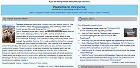
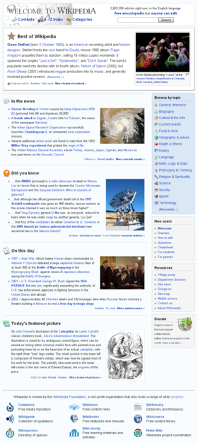
88wolfmaster

Compatibility
- POTD broken at 800 x 600, second column is at least 50% dead space. MER-C 06:47, 30 August 2008 (UTC)
- POTD can't be broken because it is the current design. 2nd column has dead space in all resolutions.--88wolfmaster (talk) 04:47, 31 August 2008 (UTC)
- POTD is broken since at lower resolutions the POTD image would push on the side of screen and cause horizontal scrolling. We've had the problem before (Dudmanfellabra, Kollision, myself, so on), recommend: User:ChyranandChloe/Workshop 6. ChyranandChloe (talk) 03:12, 2 September 2008 (UTC)
- Same dead space problem at 1920 x 1200. MER-C 04:25, 15 September 2008 (UTC)
Pros
- Clean and aesthetically-pleasing design elements. Kaldari (talk) 23:46, 4 September 2008 (UTC)
- It gets straight into the content, no waffle. Waggers (talk) 14:24, 5 September 2008 (UTC)
Cons
- The dead space created by the unbalanced allocation of content is unaesthetic, reduces accessibility, and ultimately damaging to the proposal. It is especially prevalent at lower resolutions. ChyranandChloe (talk) 03:12, 2 September 2008 (UTC)
- The right column is too narrow on 1024x768; I can't imagine how bad it gets on 800x600. The left column boxes are very wordy, also. Pretzelschatters 15:03, 3 September 2008 (UTC)
- Sections are not visually distinct from one another. Kaldari (talk) 23:46, 4 September 2008 (UTC)
Comments
- Ok, I've tested my proposal rendering on 3 separate browsers (IE7, Firefox, Chrome) at the lowest resolution possible on my computer (800 x 600) with today's panoramic picture and POTD isn't not broken. Yes, the 2nd column (a sidebar with various navigation links) does get pushed over at low resolutions but all the main (featured) content can be viewed without horizontal scrolling.--88wolfmaster (talk) 09:09, 3 September 2008 (UTC)
- Panorama or wide images will cause horizontal scrolling. The simple fix would be to cut it from the duel column, the other would be to write a custom template which allow overflow:auto. I don't think it's that big of a deal, it just needs to be considered. ChyranandChloe (talk) 03:16, 6 September 2008 (UTC)
- But it did not cause horizontal scrolling on any resolution on the 3rd (which had a panoramic photo) it simply moved the text below the photo no additional scrolling required. Next time i see another panoramic photo i will double check and this time on another monitor to see if that is causing the difference.--88wolfmaster (talk) 21:05, 6 September 2008 (UTC)
- The problem here is not the panoramic photos but ones with an aspect ratio of say, 2:1 (panoramas are over 5:1). In this case, the text gets squashed up against the side of the template in a very undesirable manner. It's visible in today's POTD, where the aspect ratio is only 1:1. MER-C 02:28, 7 September 2008 (UTC)
- It should be "fixed" now.--88wolfmaster (talk) 05:45, 8 September 2008 (UTC)
- The problem here is not the panoramic photos but ones with an aspect ratio of say, 2:1 (panoramas are over 5:1). In this case, the text gets squashed up against the side of the template in a very undesirable manner. It's visible in today's POTD, where the aspect ratio is only 1:1. MER-C 02:28, 7 September 2008 (UTC)
- I like this one the best. It reminds me of the French Wikipedia design, which I think is a whole lot better than English. SharkD (talk) 21:16, 6 September 2008 (UTC)
- I like the header and left side of this design, clean and crisp. The right side navigation needs more work, it seems out of place with the rest of the design.. one possible idea is to change the size of the 'about' and 'find an article' body text, making it more uniform with the right side? --Stuart K. Foster (talk) 10:59, 11 September 2008 (UTC)
- I automatically oppose any layout where the POTD does not stretch across the entire width of the page. howcheng {chat} 16:55, 8 October 2008 (UTC)
- the POTD is like 75% of the page, any larger and it would be a ridiculous amount of dead space.--88wolfmaster (talk) 21:31, 8 October 2008 (UTC)
Alvaro_qc

Compatibility
- POTD needs panorama stress test. MER-C 07:06, 30 August 2008 (UTC)
- POTD PASS, however it omits the past three POTDS, the image credit, and the text is unnatrually centered. ChyranandChloe (talk) 03:40, 2 September 2008 (UTC)
- In IE7 the POTD scrolls when it's too wide. That's a bit odd. Pretzelschatters 15:07, 3 September 2008 (UTC)
- That's what it is designed to do. It's better than screwing up the whole page but worse than the status quo. MER-C 10:03, 5 September 2008 (UTC)
- OK. Would you suggest I change my proposal to scroll wide images, or leave the POTD as full width? Which is better? Pretzelschatters 12:39, 5 September 2008 (UTC)
- It's up to you. MER-C 07:27, 7 September 2008 (UTC)
- 1920 x 1200 OK. Dead space problems in right column in 1280 x 960, 800 x 600. MER-C 04:27, 15 September 2008 (UTC)
Pros
Cons
- It's not in Wikipedia's font, Arial, but Verdana. Unless all other pages were changed to this font, this would be too inconsistent. You will also get a lot of hassle from accessibility people, because Arial is the most readable font for those who are visually impaired. Pretzelschatters 15:07, 3 September 2008 (UTC)
- Fixed the fonts. Alvaro qc (talk) 15:00, 7 September 2008 (UTC)
Comments
- Don't like the font change. Also too cartoony looking for my taste. Kaldari (talk) 23:40, 4 September 2008 (UTC)
- Difference in design between the left and right column is not aesthetically pleasing. A lot of white space under right column on high resolution. Jennavecia (Talk) 19:26, 6 September 2008 (UTC)
- I automatically oppose any layout where the POTD does not stretch across the entire width of the page. howcheng {chat} 16:55, 8 October 2008 (UTC)
- Don't like the white space below the second column, looks horrible. --macy 19:17, 28 October 2008 (UTC)
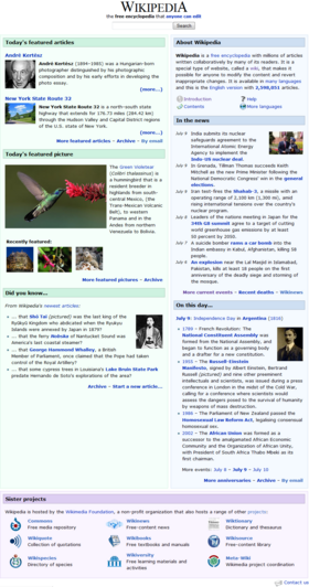
ChyranandChloe

Compatibility
- 1280 x 960, 800 x 600 OK. POTD passes the panorama stress test, though don't expect my support if POTD is still restricted to one column. MER-C 07:05, 30 August 2008 (UTC)
- Dead space issues at 800 x 600 (right column) and 1920 x 1200 (left column).
POTD breaches box at latter resolution.MER-C 04:29, 15 September 2008 (UTC)- The POTD should be corrected now. Dead space at 800x600 shouldn't be too much of a concern, since the standard left sidebar takes up 1/3 of the page, the show/hide feature allows readers to hide content without scrolling. 1920x1200, deadspace will not only apply to the main page but articles are well, since floated images will crash into other sections. ChyranandChloe (talk) 03:18, 16 September 2008 (UTC)
Pros
- Based on the format of a lot of other wikipedias. HereFord 13:51, 7 September 2008 (UTC)
Cons
- The font is inconsistent, as per my comment on the above proposal. Pretzelschatters 15:09, 3 September 2008 (UTC)
- This issue has been rectified: All titles for sections are now in veranda. All content is in Wikipedia's default. Thank you. ChyranandChloe (talk) 03:16, 6 September 2008 (UTC)
Comments
- Documentation is available regarding compatibility, significant points of interest, and so forth. ChyranandChloe (talk) 01:02, 2 September 2008 (UTC)
- I'm unsure about the Hide Sidebar feature, it seems to move the whole page around. I appreciate it can't be done on the proposal, but perhaps a Javascript show/hide would be more suitable, instead of a completely new page. Pretzelschatters 15:09, 3 September 2008 (UTC)
- The graphical treatment of the right column is different than the left column (different line thicknesses, etc.). Why is that? Kaldari (talk) 23:48, 4 September 2008 (UTC)
- During translation, the treatment of the right column was different from the left: likely to to differentiate featured content from general information (portal links, sister projects, languages, and so on). The "Hide Sidebar" was derived from Kollision's proposal (now deleted); I follow the design principal of deduction: since removing features is easier and faster than adding, as the proposal matures we can remove any features we see unfit. ChyranandChloe (talk) 03:16, 6 September 2008 (UTC)
- The difference in design between the left and right columns is not aesthetically pleasing. The round edges and differing colors is cartoony, as is the portal list. Consensus is against putting GAs on the main page, which is highly unfortunate. There is also a good deal of white space under the left column that could perhaps be resolved by pulling the featured picture out of the left column and making it full width at the bottom. Jennavecia (Talk) 19:58, 6 September 2008 (UTC)
- Consensus is not against a GA, colors, or corners. The survey is not a end-all-be-all consensus. I am also against the survey since it did not accurately represent the population: it was closed before it was noticed by many of our editors, which by that time stopped paying attention after a month of little progression. ChyranandChloe (talk) 22:06, 6 September 2008 (UTC)
- Sorry for the confusion. I didn't say consensus was against corners or colors. I said it looks cartoony, which is just a comment on my personal opinion. When I said consensus is against GA, I wasn't talking about the poll. As part of the GA project, we've proposed it before, to a great number of editor's disapproval, including a many in the FA project. Jennavecia (Talk) 05:54, 7 September 2008 (UTC)
- Consensus is not against a GA, colors, or corners. The survey is not a end-all-be-all consensus. I am also against the survey since it did not accurately represent the population: it was closed before it was noticed by many of our editors, which by that time stopped paying attention after a month of little progression. ChyranandChloe (talk) 22:06, 6 September 2008 (UTC)
- I automatically oppose any layout where the POTD does not stretch across the entire width of the page. howcheng {chat} 16:57, 8 October 2008 (UTC)
- Don't I get the benefit of some rationale? The POTD on your user page does not stretch the entire width of the page. ChyranandChloe (talk) 02:00, 10 October 2008 (UTC)
- Same as alvaro_qc, I don't like the white space below the second column, looks horrible. —macy 19:27, 28 October 2008 (UTC)
Workshop 14 (ChyranandChloe)

Compatibility
Pros
Cons
Looks horrible. --58.108.70.161 (talk) 04:49, 9 October 2008 (UTC)
- That's not a terribly helpful comment. What about it don't you like? What browser and screen resolution are you using? How can it be improved? WODUP 07:24, 9 October 2008 (UTC)
- Are you kidding? Having the logo in the background like that, with the unnecessary dialog boxes that make scrolling more annoying... this is by far the worst of a terrible bunch. Can someone direct me to who suggested the main page be updated? -because it seems at the moment to be more than fine to me.— Preceding unsigned comment added by User:220.236.59.243 (talk • contribs)
- Thanks for sharing your view, I've given you some direction on your talk page. ChyranandChloe (talk) 02:50, 11 October 2008 (UTC)
- Are you kidding? Having the logo in the background like that, with the unnecessary dialog boxes that make scrolling more annoying... this is by far the worst of a terrible bunch. Can someone direct me to who suggested the main page be updated? -because it seems at the moment to be more than fine to me.— Preceding unsigned comment added by User:220.236.59.243 (talk • contribs)
Comments
- I decided to pull code and content together to form a page similar in appearance to Wikipedia's (international) home page. I haven't optimized the code to allow better appearance and to allow space for the remaining content. However, I believe it shows some degree of promise if we can develop it. ChyranandChloe (talk) 03:52, 8 September 2008 (UTC)
- Interesting whole new approach, but nobody's going to scroll in all those little boxes. Pet peeve: "many languages" will do, no need for "many other languages". Or why not say just how many? --Hordaland (talk) 04:23, 8 September 2008 (UTC)
- Indeed very interesting. Maybe you could make the windows larger (so that we don't have to scroll) and make them semi-transparent (just the white of it) so that we can see the logo behind. Randomblue (talk) 09:54, 10 September 2008 (UTC)
- Double scroll bars for panoramic POTDs at all resolutions. They also occupy the whole box - you need to scroll down to get the caption and the horizontal scroll bar. Otherwise
 Awesome. MER-C 12:37, 10 September 2008 (UTC)
 - Thanks a lot guys, the featured content is now 10% transparent (90% opacity), the boxes are larger, and the content is more complete. Nevertheless there's still work to do, but right now, I'm kind of interested to see alternative versions. ChyranandChloe (talk) 03:24, 15 September 2008 (UTC)
- Hmm! This could be cool. Is it just ("just") Windows ME, or do the boxes not slide upwards when one above them is collapsed? — eitch 16:17, 15 September 2008 (UTC)
- It doesn't slide, our JavaScript simply tells the browser hide the content and to remove it from the wrap (inserts display:none into the inline style). It is possible with a few more lines of code give the effect of a "slide", but I do not have access to our JavaScript. Another feature I could add with JavaScript is to change the opacity to 100% when the mouse hovers over the section, but once again since I do not have access to JavaScript (onmouseover="this.style.opacity=1;[...]"). ChyranandChloe (talk) 02:41, 16 September 2008 (UTC)
Combined proposal (Scottydude)
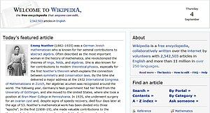
Compatibility
- Degenerates into a hodgepodge of various boxes at 1920 x 1200, begins to fall apart at 1280 x 960. MER-C 04:32, 15 September 2008 (UTC)
Pros
Cons
- There's a lot of white space under ITN section. The banner is quite bare as well, with the text on the left. Jennavecia (Talk) 03:20, 5 September 2008 (UTC)
- Yes, a major flaw in this design is the fact that the variable content in the left column will change in proportion to the right column. An option would be to put the DYK section in the left column as well and make the whitespace in the right sidebar (which would be less displeasing). Scottydude review 13:28, 5 September 2008 (UTC)
- Why not put the In the News and Did you know sections into the columned layout? Pretzelschatters 13:46, 5 September 2008 (UTC)
- Good idea. Should we make the right column follow all the way down or make it line up with the bottom of the smaller left column, where the larger one would start? (I hope that makes sense). Scottydude review 20:42, 6 September 2008 (UTC)
Comments
- Here are the changes made to 88wolfmaster's, Pretzels' and Scottydude's ideas that were used in this.... Header: I used my header. Sidebar: A combination of Pretzels' and wolfmaster's right sidebar. Content: Wolfmaster's content idea but in a different order. I also removed the icons next to the titles (DYK, ITN etc.) for a cleaner look. In general: I got rid of the links next to headings in favor of "regular" links. For instance, instead of linking the mobile content like Wolfmaster, I linked it in the "body" like Pretzel. Same with the "read more" in the about section, I placed the link below with the other help links. I believe thats all. Scottydude review 16:07, 4 September 2008 (UTC)
CrazyChemGuy
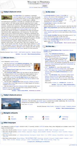
Compatibility
- 1280 x 960, 800 x 600 OK. MER-C 07:08, 30 August 2008 (UTC)
- 1920 x 1200 OK. MER-C 04:36, 15 September 2008 (UTC)
Pros
- Clean and aesthetically-pleasing design elements. Kaldari (talk) 23:51, 4 September 2008 (UTC)
- Making the search box prominent is a great idea. Waggers (talk) 14:28, 5 September 2008 (UTC)
Cons
- Redundant search box (unanimously opposed in the survey) -- Quiddity (talk) 18:53, 6 September 2008 (UTC)
- Cartoonish icons everywhere (eg Image:Nuvola apps knewsticker.png) -- Quiddity (talk) 18:53, 6 September 2008 (UTC)
- No community-oriented section -- Quiddity (talk) 18:53, 6 September 2008 (UTC)
Comments
- From a purely aesthetic point of view, I think this design is by far the best; it's nearly the only one that avoids being a variation on pastel boxes. I really prefer the clean white background for all text and the headers do a nice job of differentiating sections and keeping it from being too symmetrical. Can't speak to browser issues, but it looks nice on default IE6 and IE5 at 1280x1024. Jgm (talk) 00:47, 3 September 2008 (UTC)
- You need to adjust the padding and widths - the two columns are not quite even, and there is a large gap below the header but no gaps between each section. Also, the bullet points from In The News are too close to the edge of the box. I'm not too bothered myself, but I also think you might get some trouble for having the portal links so far down. Overall, though, it's not bad! Pretzelschatters 15:13, 3 September 2008 (UTC)
- I think this is best, aside from, as above, the lack of portals, or at least a link to the list of portals if nothing else. Very clean, and it keeps the FA and ITN at the top of the page, where they are most useful. --Izno (talk) 03:59, 5 September 2008 (UTC)
- This is the only proposal that improves on the existing mainpage; replacing the current portal list with a more prominent search box is much more useful for incoming readers and preservation of the current two-column format is ideal. I would dump all the icons, however, as they are cartoonish and unuseful. Christopher Parham (talk) 01:04, 6 September 2008 (UTC)
- I liked your banner so much, I used it in my design. Unfortunately, consensus was against a second search bar. It's a very aesthetically pleasing design. Since the portal list is full width, I'd go ahead and add the other five portals. And consensus was for dropping the "other languages" section, as it's located in the sidebar of the main page. Jennavecia (Talk) 20:02, 6 September 2008 (UTC)
- Smooth, clear, appropriately graphic -- but still manages to be fast to load even on a slower computer --hydrox (talk) 23:05, 8 September 2008 (UTC)
- What is this? An article page with an infobox or two articles on the same page? Whatever it is, it's not the main page for a top-10 Internet site. Such a main page would give people dozens of ways to delve into all the content available, not just read one or two articles on the main page. It needs navigation, a bit of color, portals, and other things that help people get a feel that this is a fun, exciting, vast, and yet serious encyclopedia. Also, why stack the search box under the title? You have a mostly empty 1.5" box at the top of the page. Float some stuff to the left and the right, and reduce that space to at least half it's size. As-is, this should not have made it into round 2. --Willscrlt (Talk) 13:32, 11 September 2008 (UTC)
Dudemanfellabra
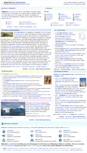
Compatibility
- 1280 x 960, 800 x 600 OK. Displays panoramas without breaking. MER-C 07:07, 30 August 2008 (UTC)
- 1920 x 1200 OK. MER-C 04:37, 15 September 2008 (UTC)
Pros
- The header is aestetic and descriptive providing clean organized meanus regarding the desired section describing What is Wikipeida. The page is carefully designed to ensure that it will properly display on most browsers and resolutions. ChyranandChloe (talk) 03:40, 2 September 2008 (UTC)
- "What is Wikipeida"? That's a very good question indeed.
 MER-C 08:50, 2 September 2008 (UTC)
- "What is Wikipeida"? That's a very good question indeed.
Cons
- The headers such as "Today's Featured Article" contains a brief but mildly distracting dead space below the text title, with which the text is above center. This issue is especially prnounced in Firefox where the corners are rounded. ChyranandChloe (talk) 03:40, 2 September 2008 (UTC)
- This was fixed by removing image:wikibar.png from all headers --Dudemanfellabra (talk) 22:48, 7 September 2008 (UTC)
- Yikes! You sure have enough text! Pretzelschatters 15:14, 3 September 2008 (UTC)
- Abundance of icons makes the top of the page look visually cluttered. Kaldari (talk) 23:52, 4 September 2008 (UTC)
- Redundant search box -- Quiddity (talk) 18:58, 6 September 2008 (UTC)
- Now removed; didn't know about the searchbox consensus until a few minutes ago --Dudemanfellabra (talk) 22:48, 7 September 2008 (UTC)
- Useless graphics (Image:Wikibar.png) everywhere -- Quiddity (talk) 19:00, 6 September 2008 (UTC)
- Now removed; I agree. --Dudemanfellabra (talk) 22:48, 7 September 2008 (UTC)
Comments
- Some of the portal and "What is Wikipedia" icons are separated from their description by line breaks in 800 x 600. MER-C 08:50, 2 September 2008 (UTC)
- Fixed in newest edit. --Dudemanfellabra (talk) 22:48, 7 September 2008 (UTC)
- I like many aspects of this design. Consensus was against the second search box, however. I think the bottom section should be the same sytle as the rest of the design. And, if possible, make the left and right columns even. Jennavecia (Talk) 20:04, 6 September 2008 (UTC)
- I took out the 2nd search box and reformatted the wikimedia section to look like the rest of the page, but I have no clue how to make the 2 columns even haha. If I could use the old HTML's height parameter, it'd be great :D. --Dudemanfellabra (talk) 22:48, 7 September 2008 (UTC)
- I just figured out how to fix the problem; the columns are now even. --Dudemanfellabra (talk) 16:57, 9 September 2008 (UTC)
- Looks better. I noticed in Internet Explorer that the rounded edges do not show up, but it looks fine with corners. All the images made for a slow page load, but overall it looks pretty good. Love your name, by the way. XD Jennavecia (Talk) 19:02, 9 September 2008 (UTC)
- I just figured out how to fix the problem; the columns are now even. --Dudemanfellabra (talk) 16:57, 9 September 2008 (UTC)
- I took out the 2nd search box and reformatted the wikimedia section to look like the rest of the page, but I have no clue how to make the 2 columns even haha. If I could use the old HTML's height parameter, it'd be great :D. --Dudemanfellabra (talk) 22:48, 7 September 2008 (UTC)
- Smooth, "modern" and graphic look. Nice one. hydrox (talk) 23:01, 8 September 2008 (UTC)
- Initial thought at the smaller "thumbnail" preview size is that it looks good and easy to scan visually. Viewing it full size, it's got a lot of wasted space that needs to be removed to be a serious contender. I don't think any of the actual content of the site appears "above the fold" on smaller screen resolutions. Incorporate some of the better navigation ideas from other designs into this one, and it will be a big improvement. Also, the "About Wikipedia" takes up too much screen space. Many studies have shown that Wikipedia, like Google, Facebook, and YouTube, are such an integrated part of our culture and have such brand name recognition, that hardly any explanation need be given. This redesign dedicates considerable space to explaining what WP is, and it's not needed. If you could redesign the navigation and cut the vertical size of the overall header (everything prior to the FA and news) at least in half, it would probably make a very good design. One last thing: why is the WikiNews logo above the news section? Are we streaming their RDF feed in now? That logo makes it appear that those news articles are coming from another Foundation Project. You should use some other generic icon to represent news, not a specific news source. --Willscrlt (Talk) 13:28, 11 September 2008 (UTC)
- I automatically oppose any layout where POTD does not stretch across the entire width. howcheng {chat} 16:54, 8 October 2008 (UTC)
Hereford

Compatibility
- Horizontal scrolling at 800 x 600 caused by header, 2nd column. "The free encyclopedia that anyone can edit" is unreadable. MER-C 06:41, 30 August 2008 (UTC)
- i've tested it in this resolution and i cant see the problem.HereFord 15:59, 31 August 2008 (UTC)
- In IE7 it is incredibly small, because you set the text size to 20%. Perhaps you meant more like 120%? Pretzelschatters 13:03, 1 September 2008 (UTC)
- i know see it i was looking it in Safari for window and i just looked at it in Google chrome and saw it.HereFord 13:59, 7 September 2008 (UTC)
- In IE7 it is incredibly small, because you set the text size to 20%. Perhaps you meant more like 120%? Pretzelschatters 13:03, 1 September 2008 (UTC)
- i've tested it in this resolution and i cant see the problem.HereFord 15:59, 31 August 2008 (UTC)
- 1920 x 1200, 1280 x 960 OK. MER-C 04:39, 15 September 2008 (UTC)
Pros
- Very interesting. So far, aside from the messiness, you are my favorite. --Lord₪Sunday 23:33, 2 September 2008 (UTC)
- Clean! Not over-designed. futurebird (talk) 03:14, 10 October 2008 (UTC)
Cons
- Symmetrical, uniform blue banner at top looks too plain, it's a throwback to the early days of the internet. Phlegm Rooster (talk) 18:28, 6 September 2008 (UTC)
- POTD looks bad at most screen sizes, with any sized image. -- Quiddity (talk) 19:03, 6 September 2008 (UTC)
- Illegibly small second line of text -- Quiddity (talk) 19:03, 6 September 2008 (UTC)
- Motto, RadioWP, PortaloftheDay, Featured List were all widely opposed in the survey -- Quiddity (talk) 19:03, 6 September 2008 (UTC)
- No community-oriented section -- Quiddity (talk) 19:03, 6 September 2008 (UTC)
- This is a main page redesign proposal, not a community portal redesign proposal
=P. macy 02:16, 30 October 2008 (UTC)
Comments
- Apart from the above note about unreadable "The free..." I like this design. I am curious as to the extent that people would have trouble viewing it so that they would want an even simpler version. I disabled javascript and was able to read it perfectly fine. Also, technical note, the left column of content is variable with screen res, but the right isn't. I'd prefer both to be, or neither, for consistency. Huadpe (talk) 04:33, 31 August 2008 (UTC)
- This reminds me of several of the smaller foreign language versions of Wikipedia where there is little content and few editors. Those Projects frequently feel like a small community of dedicated volunteers and I'm invited to look into their humble workspace as they try to build their Projects into a bigger one. The English Wikipedia is the biggest Project operated by the Foundation, and this redesign doesn't give any sense of that. It's cute, but not en.wiki main page quality. --Willscrlt (Talk) 13:23, 11 September 2008 (UTC)
- Since under this proposal FLs would be on the main page, would Raul654 (talk · contribs) scedule in the FLs or someone else? Pie is good (Apple is the best) 23:06, 9 October 2008 (UTC)
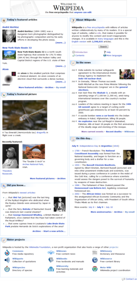
h2g2bob

Compatibility
- Should work at pretty much any res
- 1280 x 960, 800 x 600 OK. There happens to be some minor layout problems at lower resolutions (e.g. dead space second column, unfortunate line breaks) but it isn't fatal. MER-C 09:43, 8 September 2008 (UTC)
- Falls apart at 1920 x 1200 with boxes everywhere. MER-C 04:40, 15 September 2008 (UTC)
Pros
Cons
Comments
- Easily visible search box. At low resolutions, changes from 2 columns to 1 column (this might not work on IE). Groups featured/mainspace items to the left and browsing/searching on right. --h2g2bob (talk) 16:09, 7 September 2008 (UTC)
- Wow, I really like the feature where it switches from two column to one column view, that would make any design really friendly to low resolution and mobile users. How did you implement that in the code?--NickPenguin(contribs) 18:01, 7 September 2008 (UTC)
- It uses CSS: the main content has "float: right; width: 62%; min-width: 20em;" and the right-hand elements have "float: left; width: 35%; min-width: 15em;". When there's lots of space they can fit side by side because the width is less than the width of the page (ie 35% + 62% is less than 100%). When there's not much space, the minimum sizes mean that they can no longer fit side by side, so they get put above/below each other. I think the min-width CSS support was added in Internet Explorer 7, so it'll always remain in 2 columns for IE 6 users. --h2g2bob (talk) 18:37, 7 September 2008 (UTC)
- So I guess that means this feature can only be implemented in designs that use CSS instead of tables? --NickPenguin(contribs) 19:20, 7 September 2008 (UTC)
- Yes, but designs using tables could be converted to designs using CSS. --h2g2bob (talk) 21:17, 7 September 2008 (UTC)
- So I guess that means this feature can only be implemented in designs that use CSS instead of tables? --NickPenguin(contribs) 19:20, 7 September 2008 (UTC)
- It uses CSS: the main content has "float: right; width: 62%; min-width: 20em;" and the right-hand elements have "float: left; width: 35%; min-width: 15em;". When there's lots of space they can fit side by side because the width is less than the width of the page (ie 35% + 62% is less than 100%). When there's not much space, the minimum sizes mean that they can no longer fit side by side, so they get put above/below each other. I think the min-width CSS support was added in Internet Explorer 7, so it'll always remain in 2 columns for IE 6 users. --h2g2bob (talk) 18:37, 7 September 2008 (UTC)
- This is more of an article page with a sidebar than a main page. There is no indication that the site is huge, active, busy, and in-depth. As an overall proposal, this one should not have made it into round 2, but the sidebar does have some style elements that work pretty nicely and could have been incorporated into a stronger proposal. --Willscrlt (Talk) 13:20, 11 September 2008 (UTC)
Highfields
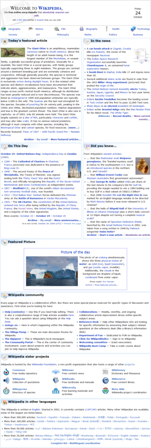
Compatibility
- 1280 x 960, 800 x 600 OK. MER-C 06:51, 30 August 2008 (UTC)
- Portal icons become too separated from description at 1920 x 1200. MER-C 04:41, 15 September 2008 (UTC)
Pros
Cons
Comments
- The info at the beginning is kind of long, and the number of visitors stat in particular seems like too much tooting of one's own horn, as opposed to useful info about what Wikipedia is. I think the structure of the section headers/content is interesting and a good design choice, however there is an inconsistency between the columns. The left column has a split between Featured/Did you know, but the right column has no split between In the news/On this day. Huadpe (talk) 04:58, 31 August 2008 (UTC)
- I think I've sorted that now Highfields (talk) (contribs) 09:37, 5 September 2008 (UTC)
This is a minor detail, but I'd reword some of the things at the top. The text there of the current main page (the free encyclopedia that anyone can edit. 2,536,613 articles in English) fits better, in my opinion. I also think portals should be moved somewhere below the box containing today's FA - On this day. CCG (T-C) 23:22, 29 August 2008 (UTC)
- I'll try to fix that Highfields (talk) (contribs) 09:37, 5 September 2008 (UTC)
- POTD needs a slight tweak, I wouldn't use that prepackaged template. MER-C 06:51, 30 August 2008 (UTC)
- I am not a fan of the top bar design here. The text is not locked to any sort of grid, and feels very disjointed. I counted nine different heights within the bar where text exists. It doesn't feel professional. Also it is slightly wider than the current homepage, which is bad because it breaks uniformity of pages (all Wikipedia pages are at most as wide as the current main page.) Huadpe (talk) 04:33, 31 August 2008 (UTC)
- I'll try to fix that too Highfields (talk) (contribs) 09:37, 5 September 2008 (UTC)
- Why does the banner say "absolutely"? It overstates what our article, which it links to, reads, and it's technically inaccurate. Otherwise, it's simple and aesthetically pleasing, the even sections are nice. Consensus was to drop the other languages, however, as they're listed on the side bar of the main page. Jennavecia (Talk) 20:08, 6 September 2008 (UTC)
- I like the design but I agree with Jennavecia. It shouldn't say "absolutely". It's technically untrue and it is changing a tag line that has become rather standard in the community. Scottydude review 21:34, 21 September 2008 (UTC)
- Not one that I would want to see implemented. The good features that are in it are also in other proposals that work better together than they do here. I think my biggest complaint is that it's just too open and spread out. It's almost vacant at the top, yet text-heavy farther down. The calendar page is an entirely useless space waster. Sorry for sounding harsh, but this shouldn't have made it into this second round as-is. --Willscrlt (Talk) 13:17, 11 September 2008 (UTC)
Kollision2

Updated version of my previous design. Less crazy features and more survey-compliant.
Compatibility
Pros
Cons
Comments
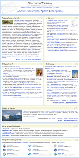
LaraLove aka Jennavecia

These are two versions of the same design. The Blue & beige is the main proposal with the Green showing the optional search bar. All colors and fonts are, of course, open to change.
Compatibility
- 1280 x 960, 800 x 600 OK. MER-C 08:56, 2 September 2008 (UTC)
- 1920 x 1200 OK (all of them). MER-C 04:42, 15 September 2008 (UTC)
Pros
- I can see a lot of people appriciating this design that are not present here, I'm not one of them. SusanLesch may be someone to talk to. She had a similar design (a bit simpler than this one) that was deleted some time ago. ChyranandChloe (talk) 03:16, 6 September 2008 (UTC)
- Very professional looking. I definitely think an opaque blue/green (same as on current main page) could be used along with the grey, as the plain grey is a little sober. OSX (talk • contributions) 07:29, 7 September 2008 (UTC)
- Alot more proffesional looking and easier to see portals. RoyalMate1 23:16, 17 October 2008 (UTC)
- Better than the older version, this time looks more professional and more encyclopedic. —macy 19:14, 28 October 2008 (UTC)
Cons
- The background of a book, small-caps serif font type, coupled with the varing colors of gray borders and background: brings the oppressive feel of a newspaper. It doesn't effectively represent the colorful vibrant content of Wikipedia. ChyranandChloe (talk) 03:16, 6 September 2008 (UTC)
- The book represents an encyclopedia. The color can be changed. A version in blue is linked on the proposal page. But I'm opposed to a bunch of different colors, as it's cartoony and unprofessional looking. Jennavecia (Talk) 19:29, 6 September 2008 (UTC)
- Dreary, symmetrical look lacks visual interest. Phlegm Rooster (talk) 18:21, 6 September 2008 (UTC)
Comments
- By far my favorite design, but can you make fix the header, the text looks squished, and maybe add light color to the headers, they look dead. -- iMatthew T.C. 14:04, 1 September 2008 (UTC)
- I'm not sure what you mean about the text looking squished. Is it the font? Someone told me I should change the font, so if you have ideas, feel free to let me know, or you can test them if you like. Also, do you think this color scheme would be better? If no, please give suggestions. :) Jennavecia (Talk) 04:53, 2 September 2008 (UTC)
- Looks strange on a high-res monitor, there's a lot of empty space underneath the TFA/ITN/DYK/OTD boxes. I think the problem is the hardcoded
style="height:400px"which keeps the boxes lined up consistently, but creates about 200px of empty space on my 1900x1200 resolution monitor. Mr.Z-man 14:45, 1 September 2008 (UTC)- I fixed that, but I'll have to ask Krimpet to take a look at the code. She fixed this problem on Simple's main page for me. Another problem I've encountered is that IE kills this design. It causes the text to be centered. Screws up the double lines in the banner, so I had to drop them to one. Any coding help would be appreciated. Jennavecia (Talk) 04:53, 2 September 2008 (UTC)
- Much better, haven't tested on IE. Mr.Z-man 04:59, 2 September 2008 (UTC)
- I fixed that, but I'll have to ask Krimpet to take a look at the code. She fixed this problem on Simple's main page for me. Another problem I've encountered is that IE kills this design. It causes the text to be centered. Screws up the double lines in the banner, so I had to drop them to one. Any coding help would be appreciated. Jennavecia (Talk) 04:53, 2 September 2008 (UTC)
- The various boxes in the columns don't vertically align at both resolutions tested (should be aligned to the top). MER-C 08:56, 2 September 2008 (UTC)
- Yes, I know.. and I can't figure out the code to fix it! :( I'm still trying to work it out... requesting help from anyone who knows how to code well. :) Jennavecia (Talk) 04:55, 3 September 2008 (UTC)
- I substantially rewrote the code underlying the design using templates - it still looks almost the same, but the wikitext behind it is now more modular, consistent, and easier to maintain and tweak. :) krimpet✽ 18:35, 4 September 2008 (UTC)
- Also I can confirm all the above bugs are fixed, and it looks great in IE too (grr, had to install it on Wine to test :p). krimpet✽ 18:37, 4 September 2008 (UTC)
- In Lynx, the links in the "Welcome to Wikipedia" section look and act strangely (missing letters, random colors, colors changing when you highlight and de-highlight links, etc.). --Carnildo (talk) 00:03, 5 September 2008 (UTC)
- Could you possibly post a screenshot? Jennavecia (Talk) 03:23, 5 September 2008 (UTC)
- Your copy of Lynx is improperly configured, Carnildo - that weird behavior is coming up because you have it set to an 8-bit character set (probably ISO-8859-1), and it's confused by Wikipedia's multi-byte characters, such as the bullets in this design; many of our articles with foreign characters would be similarly affected. Hit 'O' for options, and choose "UNICODE (UTF-8)" from the "Display character set" drop-down, it should then work. :) krimpet✽ 04:35, 5 September 2008 (UTC)
- Could you possibly post a screenshot? Jennavecia (Talk) 03:23, 5 September 2008 (UTC)
- The "about" box puts too much dead content at the top that readers will need to plow through, I don't like the idea of adding portal icons, and the monochrome scheme does not seem very attractive to me. It fails to resolve what I think is the biggest problem with the current main page - too much prominence given to browsing technologies that I don't believe readers would find useful - but on the plus side it preserves the current two-column format, which is working well. Christopher Parham (talk) 18:06, 6 September 2008 (UTC)
- If consensus is against it (I'll go check, I think I removed everything from my design that consensus opposed), then that section can just be pulled out completely, which would put the TFA and ITN at the top, as it is on the current page. :) Jennavecia (Talk) 19:54, 6 September 2008 (UTC)
- I guess I would not put too much emphasis on the results of a survey that saw such limited response. Christopher Parham (talk) 22:40, 6 September 2008 (UTC)
- If consensus is against it (I'll go check, I think I removed everything from my design that consensus opposed), then that section can just be pulled out completely, which would put the TFA and ITN at the top, as it is on the current page. :) Jennavecia (Talk) 19:54, 6 September 2008 (UTC)
- Could the transparent book be removed and replaced by a zoomed-in Wikipedia logo like on here: Image:Pretzes-030908.PNG? OSX (talk • contributions) 07:34, 7 September 2008 (UTC)
- It's possible. I opted not to use the globe because the skin for all unregistered users (as well as the default and most popular skin for registered users) is Monobook, which has the logo present on the top left. I also used the globe in the headers. Considering we are an encyclopedia, I think the book is a good visual representation of that, and prevents overuse of the globe. Jennavecia (Talk) 19:30, 7 September 2008 (UTC)
- How about zooming in on the book image like done here? I just think the current positioning looks a bit awkward. OSX (talk • contributions) 06:09, 8 September 2008 (UTC)
- I'll try that. Jennavecia (Talk) 14:37, 8 September 2008 (UTC)
- How about zooming in on the book image like done here? I just think the current positioning looks a bit awkward. OSX (talk • contributions) 06:09, 8 September 2008 (UTC)
- It's possible. I opted not to use the globe because the skin for all unregistered users (as well as the default and most popular skin for registered users) is Monobook, which has the logo present on the top left. I also used the globe in the headers. Considering we are an encyclopedia, I think the book is a good visual representation of that, and prevents overuse of the globe. Jennavecia (Talk) 19:30, 7 September 2008 (UTC)
- I just saw the new simple.wiki main page recently, and I really liked it. It works really well for that project. The "About Wikipedia" in all of these proposals takes up too much screen space for en.wiki. Many studies have shown that Wikipedia, like Google, Facebook, and YouTube, are such an integrated part of our culture and have such brand name recognition, that hardly any explanation need be given. This redesign dedicates considerable space to explaining what WP is, and it's not needed. In simple.wiki, it's important to explain how Simple is different from en.wiki, but here, it is wasted space that people will skip past after their first visit. The blue color scheme is the only one I like (though the green is not bad; yellow looks nearly like a fluorescent highligher on my LCD monitor, making it very distracting to try to read the text. The gray, as mentioned above, is gloomy. It's perhaps a little too Victorian in its sensibilities to me to stand for the English Wikipedia--a site that is uncensored and as diverse as the English-speaking human collective. I think something a little more modern would more accurately portray the brand that is Wikipedia. All that said, I personally like this design very much, but I don't think it's quite right for this Project. --Willscrlt (Talk) 13:15, 11 September 2008 (UTC)
- Thanks for the comments. I removed the About WP section from the green version. I'll see if I can tweak it a bit more otherwise for a different look. Jennavecia (Talk) 16:19, 11 September 2008 (UTC)
- Thanks for the quick response. It looked a lot better without the about WP section. I hope you don't mind, but I hacked up your version a bit. You can see it in my sandbox. I tweaked the header so that it is broken into three DIVs. The first is left floated, the second right floated (and still looks good on small screens), and the third centered below the other two. I think it is good to vertically shorten the height of the banner and move the second search box farther away from the main one. I fixed the capitalization on the Wikipedia name (please only tweak the style of the letter, not the capitalization of the trademarked name). The biggest difference was adding a modified version of Pretzel's navigation boxes to the right. I think it really brightens up the page (no longer gloomy) and helps to show how much information is available here. There were a few top-level portals that were missing, so I added them. There should be a top-level portal for social sciences (but there doesn't seem to be one). I also re-added the About WP section since the space could use a little extra content to even out the columns. I also tweaked some of the CSS a bit in various places. This combines the best of the two designs I've seen in this proposal. I hope you like it and aren't offended. --Willscrlt (Talk) 11:33, 13 September 2008 (UTC)
- I don't mind, but I think it's too cramped with three columns, and the third doesn't match the design at all. Jennavecia (Talk) 06:03, 29 September 2008 (UTC)
- Thanks for the quick response. It looked a lot better without the about WP section. I hope you don't mind, but I hacked up your version a bit. You can see it in my sandbox. I tweaked the header so that it is broken into three DIVs. The first is left floated, the second right floated (and still looks good on small screens), and the third centered below the other two. I think it is good to vertically shorten the height of the banner and move the second search box farther away from the main one. I fixed the capitalization on the Wikipedia name (please only tweak the style of the letter, not the capitalization of the trademarked name). The biggest difference was adding a modified version of Pretzel's navigation boxes to the right. I think it really brightens up the page (no longer gloomy) and helps to show how much information is available here. There were a few top-level portals that were missing, so I added them. There should be a top-level portal for social sciences (but there doesn't seem to be one). I also re-added the About WP section since the space could use a little extra content to even out the columns. I also tweaked some of the CSS a bit in various places. This combines the best of the two designs I've seen in this proposal. I hope you like it and aren't offended. --Willscrlt (Talk) 11:33, 13 September 2008 (UTC)
- Thanks for the comments. I removed the About WP section from the green version. I'll see if I can tweak it a bit more otherwise for a different look. Jennavecia (Talk) 16:19, 11 September 2008 (UTC)
- In IE7 the text continues beyond the boxes to become unreadable, this would need to be fixed for this layout to work. But the design looks great otherwise! I really like the layout! Please try to fix the text wrapping issue. Hazelorb (talk) 18:50, 28 October 2008 (UTC)
MindstormsKid

- Wikipedia:2008 main page redesign proposal/MindstormsKid - Bright coloring, collapsible boxes
- Wikipedia:2008 main page redesign proposal/MindstormsKid (2) - Pastel coloring, fixed boxes (See below)
Compatibility
- 1280 x 960, 800 x 600 OK. MER-C 06:53, 30 August 2008 (UTC)
- 1920 x 1200 OK. MER-C 04:43, 15 September 2008 (UTC)
Pros
Cons
- Too bright for my liking. –Juliancolton Tropical Cyclone 01:56, 29 August 2008 (UTC)
- Please see the talk page. Thanks! ≈ MindstormsKid 02:32, 30 August 2008 (UTC)
- It's debatable how useful collapsable boxes are if the page doesn't remember your settings. Pretzelschatters 14:57, 3 September 2008 (UTC)
- The second blue Wikipedia bar at the top is not needed. Pretzelschatters 15:41, 15 September 2008 (UTC)
- Colors used are too bright and cartoony. macy 04:27, 30 October 2008 (UTC)
Comments
- I don't think I need to change it much (apart from two bugs), since the survey (and chats on IRC) indicated that everyone liked it. The only other thing is the colors; most of them I just randomly chose. Please tell me on the talk page what colors you would like. ≈ MindstormsKid 21:42, 27 August 2008 (UTC)
- Unboxing everything is interesting, but I think leaves the page looking kind of bare. Also, in the Wikipedia dropdown, the left and right text are not on the same grid, which always irks me, off-grid text is one of those things that makes you feel unprofessional. Re: the colours, bright colours become a readability issue on some less-capable screens, particularly black and white ones, as well as for colourblind people. Pastels (the current colours on the frontpage) have more white in them, and thus have better contrast for users who might have problems dealing with colour backgrounds. Huadpe (talk) 04:53, 31 August 2008 (UTC)
- The off-grid thing is a bug, I'm hoping to get it fixed soon. ≈ MindstormsKid 13:54, 1 September 2008 (UTC)
- Show/Hide boxes don't work in Mozilla (yes, I mean Mozilla, not Firefox) it's a problem on all Wikipedia pages and is only slightly annoying but I think it might be a consideration when using them on the main page, though I suppose very few people use Mozilla. Stardust8212 13:39, 4 September 2008 (UTC)
- I have made a new version that has no show/hide links and pastel colors. ≈ MindstormsKid 23:11, 5 September 2008 (UTC)
- Consensus was, unfortunately, against a second search box. Jennavecia (Talk) 19:35, 6 September 2008 (UTC)
- The colors in the new version are much better. Kaldari (talk) 21:35, 9 September 2008 (UTC)
- Everything I said about your #2 design holds true here, but even more so. This looks like something from the 1990s (color wise), not something you would find on a top-10 Internet site in the world. --Willscrlt (Talk) 13:05, 11 September 2008 (UTC)
MindstormsKid (2)

Compatibility
- Header goes all funky at 800 x 600 - you tried to cram too much stuff in horizontally. MER-C 07:13, 7 September 2008 (UTC)
- 1920 x 1200 OK. MER-C 04:43, 15 September 2008 (UTC)
Pros
- Nice and heat!-21:43, 12 October 2008 (UTC)
Cons
- Icons in headings serve no purpose and clutter the page. Cacycle (talk) 02:17, 14 October 2008 (UTC)
Comments
- This is the one everyone seems to want. It is my older design without the show/hide boxes, and with pastel colors. ≈ MindstormsKid 23:09, 5 September 2008 (UTC)
- I don't really understand the motivation for putting a lot of "about Wikipedia" content near the top of the page. What other website with similar visibility explains itself in this fashion? I regard that as wasted space which drives down the actual content of the page. On the other hand, the allocation of space above the fold to different browsing methods makes more sense than in the current layout. Christopher Parham (talk) 18:16, 6 September 2008 (UTC)
- As Christopher points out, the "About Wikipedia" takes up too much screen space. Many studies have shown that Wikipedia, like Google, Facebook, and YouTube, are such an integrated part of our culture and have such brand name recognition, that hardly any explanation need be given. This redesign dedicates considerable space to explaining what WP is, and it's not needed. The font, at least in the screenshot, is too wispy and does not display well on my LCD monitor. The current standard font seems far more accessible friendly. It also feels more like an article page than the main page. There's a lot of content text for the specific articles mentioned, but few tastes of the overall richness that can be found inside the "covers" of this "book". I just don't think it works for a main page. --Willscrlt (Talk) 13:04, 11 September 2008 (UTC)
- What part has that font? I don't think I changed it... ≈ MindstormsKid 15:03, 15 September 2008 (UTC)
NickPenguin
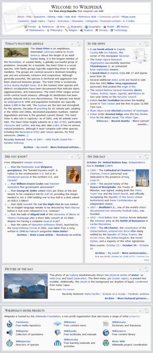
- Wikipedia:2008 main page redesign proposal/NickPenguin
- Based off Jennavecia's first design, with the About and Other Areas of Interest sections removed, and instead increasing the number of links in the welcome bar.
Compatibility
- 1920 x 1200, 1280 x 960 OK. MER-C 04:44, 15 September 2008 (UTC)
Pros
Cons
Comments
- Surely fixable: Text in ITN and DYK is too wide for their respective boxes - longest lines are cut off. --Hordaland (talk) 09:55, 13 September 2008 (UTC)
- As I've opined before, it took me months starting out to figure out which main page links took me where, especially as some in the left panel and some in main page content appear identical, but aren't. (I haven't clicked through yours to see.) If links from left panel indeed need be repeated in welcome bar (which I doubt, as people should get used to using left panel), please at least give them the identical mouseover text. Thanks. --Hordaland (talk) 09:55, 13 September 2008 (UTC)
- Until you said that, I don't think I'd ever really noticed the side bar. All the links go to the same place though (by chance). I really like idea of a larger and more functional welcome bar, since the main page should be like a giant sign post for casual readers. --NickPenguin(contribs) 00:47, 14 September 2008 (UTC)
- Remarkably similar to Jennavecia's first design: to the point where I am beginning the point where I feel that it should be combined. ChyranandChloe (talk) 03:24, 15 September 2008 (UTC)
- You're right, they are basically the same. I don't have any problem turning them into one design. --NickPenguin(contribs) 11:39, 15 September 2008 (UTC)
- I intentionally left those links out of my design, as users need to learn and rely on the sidebar for such navigation. Jennavecia (Talk) 16:01, 15 September 2008 (UTC)
- Shrug. Like I said, I never even noticed the sidebar, and I'm sure I'm not the only user like that. At the very least, I think we should consider putting links to the community side of things in a more prominent position, in order to turn more readers into editors. --NickPenguin(contribs) 21:39, 15 September 2008 (UTC)
- I intentionally left those links out of my design, as users need to learn and rely on the sidebar for such navigation. Jennavecia (Talk) 16:01, 15 September 2008 (UTC)
- You're right, they are basically the same. I don't have any problem turning them into one design. --NickPenguin(contribs) 11:39, 15 September 2008 (UTC)
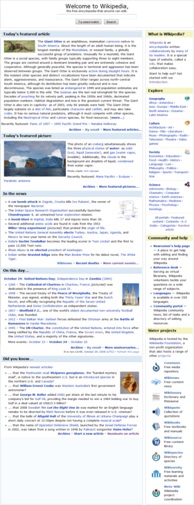
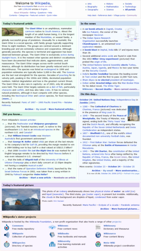
Pretzels

Compatibility
- Fluid widths, optimized for 1024 x 768 but also tested on 1680. PretzelsTalk! 11:20, 29 September 2008 (UTC)
Pros
- I really like it. I think there is a lot of good ideas here. Scottydude review 14:51, 2 September 2008 (UTC)
- This proposal takes little for granted. The sections have been redesigned, and careful attention has been placed to ensure that all sections essentially fit together. ChyranandChloe (talk) 03:16, 6 September 2008 (UTC)
- It's good, clean and bright. Hiding T 15:06, 7 September 2008 (UTC)
- As far as I can see, it's the only option currently offering a large image without any scrolling. --Dweller (talk) 14:11, 10 September 2008 (UTC)
- Exciting, bright and effervescent. Maybe a little too much, but works for me.--Shahab (talk) 11:27, 9 October 2008 (UTC)
- Much more interesting than current page-liking the easy search and new header!Maniacgeorge (talk) 20:48, 12 October 2008 (UTC)
Cons
- The text size is unnaturally large in some areas, and unnaturaly small in others. It may be desired in the case to place emphasis on the titles, however it can be viewed as unprofessional. The POTD is not autoupdated, and a redesign of the POTD could meet opposition from the POTD Wikiproject: who would have to redesign its long standing template. ChyranandChloe (talk) 03:40, 2 September 2008 (UTC)
- My Picture of the Day design is actually nearly identical to the current one, and any proper redesign of the Main Page will inevitably affect the templates used. The only content missing from my version is the recently featured listing, which is already accessible via More featured pictures. Pretzelschatters 14:51, 3 September 2008 (UTC)
- A proper redesign does not inevitably require a template redesign: though, I would try to see it as a positive than a negative — it shouldn't bee that big of a deal and I see some good potential from a template redesign (if you start a discussion give me a message). The POTD wastes space on either side of the image as the screen resolution increases. ChyranandChloe (talk) 03:16, 6 September 2008 (UTC)
- Um, to that last comment about wasted space: the images are always good and sometimes spectacular. They deserve white space; I don't see it as wasted. --Hordaland (talk) 08:46, 6 September 2008 (UTC)
- This is quite frustrating because I originally added more whitespace to POTD to comply with User:MER-C's problems with 800x600. Pretzelschatters 16:30, 8 September 2008 (UTC)
- Um, to that last comment about wasted space: the images are always good and sometimes spectacular. They deserve white space; I don't see it as wasted. --Hordaland (talk) 08:46, 6 September 2008 (UTC)
- Near-centering of photo is too symmetrical. The large Wikipedia graphic top looks like a typical ad banner. Phlegm Rooster (talk) 18:20, 6 September 2008 (UTC)
- Icons that serve no purpose clutter the page. Cacycle (talk) 02:15, 14 October 2008 (UTC)
Comments
- I really like this one. It's different, it's good-looking. The white space in the POTD section is not a deal-breaker for me. WODUP 07:51, 7 September 2008 (UTC)
- Thanks WODUP. PretzelsTalk! 21:31, 17 October 2008 (UTC)
- The two things I really like about this, and would like seeing added to another proposal that handles the rest of the layout better, is the "Find an Article" and DYK sections. Your FaA section is brilliant! It is user friendly, very scannable, easy to understand regardless of native language, and does not come across as immature or unprofessional. I do not think that the big globe next to the standard globe in the corner is necessary, and in fact, clash with each other. On the other hand, that whole header does a great job of brand promotion -- far more so than most of the other proposals. But are we selling Wikipedia, or trying to get people into the articles? --Willscrlt (Talk) 13:00, 11 September 2008 (UTC)
- I combined your really excellent "Find an article" section with another design and created this version that combines the best elements from the great proposals into a single one. I hope you like it and aren't offended by it. --Willscrlt (Talk) 11:36, 13 September 2008 (UTC)
- I think that this is best looking design. The only issue is the amount of empty space at the bottom. Maybe it ought to be filled up by some the latest questions from the various reference desks. This would give the impression that this site has something else then data in it. Cheers--Shahab (talk) 18:24, 15 September 2008 (UTC)
- Okay, here we go. :) At 800x600, the POTD image size is too large for the div, and it runs into the right column. At 1280x800, the Resources box on the right hangs into the WikipediaSister div when the window is maximized, but it doesn't run into the text, so it'll be okay. In general, I find that the rightmost text on the line (or lines, depending on window size) below Welcome to Wikipedia run into the border. I previewed the page with a padding-right:5px to see if that would help. It didn't. It might just be my computer, though. Lastly, I really dislike having the featured picture image in the thumbnail; I say take out the |thumb. Everything else – the white background in the main section, the colored boxes on the right – is really awesome. WODUP 04:18, 27 September 2008 (UTC)
- The POTD and WikipediaSister issues have been corrected, thank you. I think that for consistency, Best of Wikipedia should stay Featured Article and (I don't know how I missed this last time) the search in the header should be removed; it is redundant to the one in the sidebar. Having the featured article's picture thumbnailed on the right works. Cheers, WODUP 16:39, 7 October 2008 (UTC)
- I really like the design. I think that the functionality needed is present. The only thing I have to say is simply out of personal preference and holds no significant weight: I like the header from this version better. Maybe its just because I like the left alignment, but there is something more "catchy" about it. Anyways, I think the design is great. Scottydude talk 16:06, 7 October 2008 (UTC)
- Thanks Scottydude. The header was changed to make it much smaller height-wise, so more content would show above the fold. However, I've taken your comment and redesigned the header again - it is now a flatter version of the one you liked. PretzelsTalk! 21:31, 17 October 2008 (UTC)
RyRy 2
Compatibility
Pros
Cons
Comments
- Has it been decided that we want a completely renovated Main Page? Or do we just want some tweaks to the Main Page? If so, I'll be happy to change my proposal. Thanks, RyRy (talk) 22:51, 20 September 2008 (UTC)
- Why not make two different proposals? — Twas Now ( talk • contribs • e-mail ) 00:44, 21 September 2008 (UTC)
- This is my second. My first one is located at Wikipedia:2008 main page redesign proposal/RyRy, but I'm still making some fixes to it. -- RyRy (talk) 00:50, 21 September 2008 (UTC)
- Has it been decided that we want a completely renovated Main Page? Or do we just want some tweaks to the Main Page? If so, I'll be happy to change my proposal. Thanks, RyRy (talk) 22:51, 20 September 2008 (UTC)
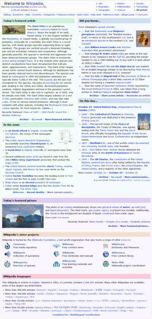
- Similar to the current main page, only added boxes to the Sister Projects and Other Languages section while omitting important links to the Reference and Help desks. ChyranandChloe (talk) 19:05, 20 September 2008 (UTC)
- the RefDesk and Help Desk are right at the top. — Twas Now ( talk • contribs • e-mail ) 19:43, 20 September 2008 (UTC)
- My mistake. ChyranandChloe (talk) 21:26, 21 September 2008 (UTC)
- the RefDesk and Help Desk are right at the top. — Twas Now ( talk • contribs • e-mail ) 19:43, 20 September 2008 (UTC)
Scottydude

Compatibility
Layout still broken with lots of dead space at 800 x 600.MER-C 06:48, 30 August 2008 (UTC)- Should be fixed now. Scottydude review 15:07, 1 September 2008 (UTC)
- As the window size reduces the margin sizes will decrease until it is not large enough and the sections wrap on top of each other, as the window size increases the margins size will increase causing it to be disproportionally large and distracting. This is because the inline CSS is relative to the width of the page, not the width of the content area. I cannot think of a remedy except for tables. However the CSS does hold potential for other (more radical) designs. ChyranandChloe (talk) 02:25, 8 September 2008 (UTC)
- Boxes become too far spaced out at 1920 x 1200. MER-C 04:45, 15 September 2008 (UTC)
Pros
- Not too cluttered. futurebird (talk) 03:16, 10 October 2008 (UTC)
Cons
Comments
- I've made some changes to the design. I removed the language section at the bottom and put the sister projects and other areas in a sudo column view (using some ideas and markup from 88Wolfmaster). I'd like to ask for some comments on the design, I'd love more feedback. Scottydude review 15:44, 2 September 2008 (UTC)
- I would suggest moving the "Find an article" contents (which I like a lot) into that empty space currently filled by today's date. Kaldari (talk) 21:48, 5 September 2008 (UTC)
- Overly simple, for my tastes, but surely others will appreciate it. There is a space between boxes on the left column but not on the right. The other wikis links are uneven and the box does not match the size of the one to the left of it. Font is very large in some places and very small in others. Jennavecia (Talk) 19:47, 6 September 2008 (UTC)
- I agree. Very plain and lots of space between the bottom sections at higher resolutions. WODUP 07:43, 7 September 2008 (UTC)
- One of the better designs: simple, fast and not flooded with information like the current main page hydrox (talk) 22:51, 8 September 2008 (UTC)
- Overall, I like it. It could use a little more color. Adding a photo to the FA would help without resorting to coloring up the layout. The description of Wikipedia takes up too much screen space. Many studies have shown that Wikipedia, like Google, Facebook, and YouTube, are such an integrated part of our culture and have such brand name recognition, that hardly any explanation need be given. This redesign dedicates considerable space to explaining what WP is, and it's not needed. I think that you could eliminate the calendar from the corner. Most people know the current date, and it occupies space that could be used for something more useful. For example, you could move the Find an Article box up fully to the top of the area, perhaps add a search box there, too (since people are requesting it, though I think it's generally redundant but would be logical in a section titled Find an Article), and shorten the Wikipedia description. Basically something that is a 6-cell rectangle, where cells 1 and 4 expand horizontally into cells 2 and 5, and cell 3 expands down into cell 6. The Wikipedia header would occupy cells 1/2, the description would occupy cells 4/5, and the Find an Article would occupy cells 3/6. The whole thing would be more compact, but wouldn't really lose anything other than the calendar. Just a thought. --Willscrlt (Talk) 12:53, 11 September 2008 (UTC)
Wintran 5

Compatibility
- Slight amount of horizontal scrolling at 800 x 600. POTD needs testing. MER-C 07:18, 7 September 2008 (UTC)
Pros
- Your layouts for Featured Articles and In the News are great. Perhaps the featured articles could be compacted a little, but they're nice, modern, clean, and innovative layouts. Pretzelschatters 15:20, 3 September 2008 (UTC)
- Thank you! Feel free to re-use in your own proposals however you like. - Wintran (talk) 23:27, 3 September 2008 (UTC)
- Now I look at your Featured Articles again, I think it would be better if the titles were aligned with the body text. Pretzelschatters 12:41, 5 September 2008 (UTC)
- Thank you! Feel free to re-use in your own proposals however you like. - Wintran (talk) 23:27, 3 September 2008 (UTC)
Cons
- Overlarge Wikipedia at top is centered; creating unwanted symmetry and concommitant lack of visual interest. Phlegm Rooster (talk) 18:24, 6 September 2008 (UTC)
- Search bar in the body is redundant to the one in the sidebar. WODUP 07:40, 7 September 2008 (UTC)
Comments
- I like this design. It's clean and simple, not cartoony. But there is no consensus for three featured articles or previously featured images. Consensus was also against a second search box. I think it would also improve the look of the design to have the banner be the same width as the columns. Jennavecia (Talk) 19:50, 6 September 2008 (UTC)
- Thanks for your comment! I believe the main thing that contributes to the feeling of cleanliness is my reduction of wiki-links in almost every section (compare with current main page). I would love to see more designers experiment with this. You might be right that the top banner would look better with a width of 100%. I'm aware of the survey results, but I believe it was lacking in many areas. Judging from previous discussions and proposals I believe the idea of three featured articles gained quite a lot of support, and the duplicated search bar issue has been controversial rather than settled. In any case, I don't think we should stop experimenting with new features that easily. - Wintran (talk) 13:06, 7 September 2008 (UTC)
- Less drab than current design. Sharp looking, but somehow gives more of a corporate or commercial feel. I personally like three featured articles and a 2nd, unmissable search box. From work on the reference desk I know that many new users fail to simply try searching for the topic they're curious about. ike9898 (talk) 02:23, 7 September 2008 (UTC)
- Yes, from other non-Wikipedians I've talked to, their biggest issue with the Main page is finding the search bar. As searching is Wikipedia's most important tool for browsing I think the duplication is worth it, and I'm once again tempted to move it to the top-center box, as people are familiar with that placement from Google and other search engines (see Wintran 3). At least until the original search box is moved to the top of the sidebar or some place much more visible. You're right that the current box design might give too much of a commercial feel. It can quite easily be switched to another, such as in Wintran 6 where I borrowed the design from Jennavecia's proposal. - Wintran (talk) 13:06, 7 September 2008 (UTC)
- On Wintran 6, the sister projects header isn't full width. I looked at the code, but I don't see the problem. I like that design. Again, a bit simple for my taste, but it does look nice. As you are also a fan of the second search box (which I think was moved up on the main page a few weeks ago), you might like to work in a banner similar to the one I used here. Center placement in the header, similar to Google. Jennavecia (Talk) 19:45, 7 September 2008 (UTC)
- This would be a terrific main page for WikiJunior. It has a young and friendly feeling, without being cartoonish or childish. That, unfortunately, works against it for the English Wikipedia main page, because it doesn't command the respect that would like to see from the main page here. The "About Wikipedia" takes up too much screen space. Many studies have shown that Wikipedia, like Google, Facebook, and YouTube, are such an integrated part of our culture and have such brand name recognition, that hardly any explanation need be given. This redesign dedicates considerable space to explaining what WP is, and it's not needed. I really like having multiple featured articles, but wonder how FA editors are going to feel sharing the spotlight. Will there be a bias against FA#2 (not quite as featured as FA#1?) Also, it seems more like the news now. I always try to visit the Main Page each day to see that one special article and then glance at the news to see what's changed. I think I would lose the sense of urgency to view the page with multiple articles because of dilution. This issue affects all the proposal with multiple FAs on the main page, not just yours. --Willscrlt (Talk) 12:45, 11 September 2008 (UTC)
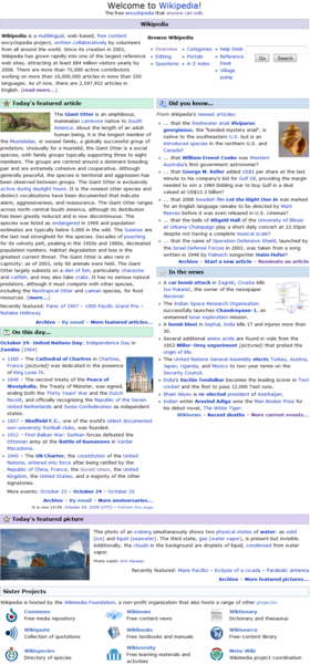
Wintran 7
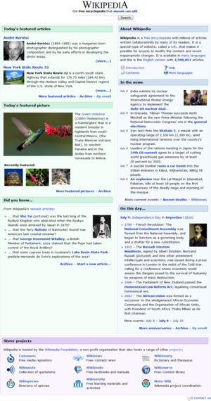
- Wikipedia:2008 main page redesign proposal/Wintran 7 (Pictured)
- Wikipedia:2008 main page redesign proposal/Wintran 8 - Same but without about box
Compatibility
- 1280 x 960, 800 x 600 OK. POTD seems too small with insufficient detail at all resolutions and squinting users at higher resolutions. MER-C 12:22, 10 September 2008 (UTC)
- I'm guessing you're referring to panoramas and very wide images, as these would become very small with the limited width of my POTD section. Yet, I'm already doubtful of the usefulness of featured images with extreme ratios on the main page, and think it might be worth loosing them if it means the POTD section can be moved up on the page. - Wintran (talk) 17:48, 27 September 2008 (UTC)
Pros
Cons
- Previous POTD thumbnails will look bad when the sizes vary drastically (consider a combination of portrait orientation, landscape, and a panorama). howcheng {chat} 16:51, 8 October 2008 (UTC)
Comments
- This version uses the same box design and color scheme as the current main page. - Wintran (talk) 00:23, 10 September 2008 (UTC)
- Overall, it's fresh and appealing. The font should be put back to the current font for accessibility reasons as mentioned many times above. The header takes up considerable space that could be easily reduced by moving the search box (which is already in the left column in monobook) to the right of the name so that they sit side-by-side, if it's even necessary with the standard search box nearby that has more options. The "About Wikipedia" takes up too much screen space. Many studies have shown that Wikipedia, like Google, Facebook, and YouTube, are such an integrated part of our culture and have such brand name recognition, that hardly any explanation need be given. This redesign dedicates considerable space to explaining what WP is, and it's not needed. I really like having multiple featured articles, but wonder how FA editors are going to feel sharing the spotlight. Will there be a bias against FA#2 (not quite as featured as FA#1?) Also, it seems more like the news now. I always try to visit the Main Page each day to see that one special article and then glance at the news to see what's changed. I think I would lose the sense of urgency to view the page with multiple articles because of dilution. This issue affects all the proposal with multiple FAs on the main page, not just yours. --Willscrlt (Talk) 12:41, 11 September 2008 (UTC)
- Thanks for your comment! The font should be the same as the current main page. If not, please tell me. I believe the header takes up about the same space as the current main page header (remember that the default article title will not be shown in the final version). In this design, I wanted to keep the title and search bar centered to give them maximum focus, similar to Google and other search engines, so I don't believe in aligning them next to each other. You have a point in that people already know what Wikipedia is. My idea with the about-box was to give effective information about the idea and structure of Wikipedia that new visitors might be unaware of, including the language division and editing capabilities such as the history feature (so users are not put off to make changes in the fear of doing something wrong). Yet, it might be redundant, so I've made another version without the about box. Perhaps the biased FA placement could be solved by deciding that new FAs are always placed on top, pushing down the one below, and that they're only added one at a time, with some hours delay. I don't think the FA section will be confused with a news service, especially as we have a separate "In the news" section next to it. - Wintran (talk) 17:48, 27 September 2008 (UTC)
- I think the two FA are a positive step, could even be extended to 3 or 4. FA should be the target for all articles and more should be getting main page exposure. Gnangarra 13:49, 11 September 2008 (UTC)
- Yes, I also like the idea of multiple FAs (originally from Wikipedia:2008 main page redesign proposal/Gnangarra). I used three FAs in my previous design, but after vewing Wikipedia:Featured article statistics it seems that two FAs per day is a more realistic number. Yet, it has room for future expansion. - Wintran (talk) 17:48, 27 September 2008 (UTC)
- Ah, didn't see you were Gnangarra when I wrote that :D I got the multiple FA idea from your design above. Did you come up with it yourself? - Wintran (talk) 21:30, 27 September 2008 (UTC)
- Yes, I also like the idea of multiple FAs (originally from Wikipedia:2008 main page redesign proposal/Gnangarra). I used three FAs in my previous design, but after vewing Wikipedia:Featured article statistics it seems that two FAs per day is a more realistic number. Yet, it has room for future expansion. - Wintran (talk) 17:48, 27 September 2008 (UTC)

