User:5910 C/sandbox
Appearance
This is an essay. It contains the advice or opinions of one or more Wikipedia contributors. This page is not an encyclopedia article, nor is it one of Wikipedia's policies or guidelines, as it has not been thoroughly vetted by the community. Some essays represent widespread norms; others only represent minority viewpoints. |
It's fair to say most English Wikipedia editors have little interest in the mobile site. Yet that site accounts for around half of English Wikipedia's traffic. Is there another mainstream website that displays such indifference to half its audience?
- Tables
-
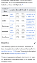
No attempt has been made to fix the browser's overzealous wrapping tendencies.
-
This is very much a desktop layout.
-
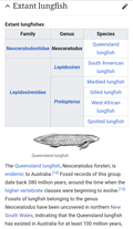
Not only does this "multi-column" table require unnecessary horizontal scrolling, it looks weird doing it.
-
A "multi-column" table that leads to all sorts of wrapping problems.
-
This looks alright at first glance. But notice the poor positioning of the flags and the indenting on the left.
-
A column of prose causes major layout problems.
-
Moving the prose beneath the table makes the table look like a table.
-
This is an even worse example
-
After fixing, you can actually see stuff on the screen.
-
A sort of progression table that works reasonably well on desktop and not at all on mobile.
-
Using the wrong class allows mobile style rules to break the table.
- Infoboxes
-
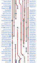
An excessively complex railway route diagram that has been ill-fittingly placed inside an infobox.
- Misc.
-
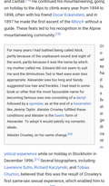
Squashed text on the right.
-
Squashed text on the left.
-
This box hasn't been scrolled to the right - this is how the section appears when loaded. Amusingly, it is impossible to scroll to the left, making this section of the article essentially unreadable on mobile.
-
A poorly performing nested list. The indifferent attitude from editors after being alerted to this issue speaks volumes.
-
A hideous piece of UI.


