Template talk:POTD/2022-01-01

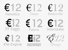
It seems to me that it would be appropriate for the accompanying text to include this sentence from the euro sign article: While the European Commission intended the logo to be a prescribed glyph shape, type designers made it clear that they intended instead to adapt the design to be consistent with the typefaces to which it was to be added.[1]
. (See image, right. I am not proposing that this image be included with the PotD, but rather to evidence the text I consider should be added, to demonstrate that this is exactly what they did. The only place that people will see the euro sign constructed as the Commission originally proposed is on bank notes, never in print or online text.)
Just my two eurocents worth, to be accepted or rejected as the jury considers appropriate. --John Maynard Friedman (talk) 01:01, 28 December 2021 (UTC)
- Fair enough – I've added the sentence to the blurb. Thanks! — RAVENPVFF · talk · 21:48, 28 December 2021 (UTC)
References
- ^ "Typographers discuss the euro". Evertype.com. December 1996.
Officially or formally?
[edit]I wonder if as officially specified
(by the European Commission) should actually read as formally specified
? Is it a 'formal specification' or an 'official specification'? Actually it is both: it is expressed very formally, stating precise lines, spacing, angles and intercepts. But it is also the official, final and definitive record. A judgement call but I guess it is too late to revisit it now, fairy godmother will be here soon. :-D --John Maynard Friedman (talk) 01:01, 31 December 2021 (UTC)
- I agree with what you say and have made the change. Cwmhiraeth (talk) 06:27, 31 December 2021 (UTC)
