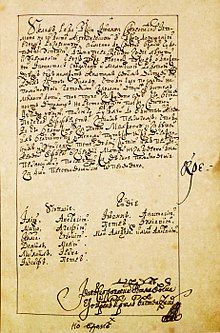
Skoropis

Skoropis (Russian: ско́ропись; Ukrainian: ско́ропис, romanized: skoropys) is a type of Cyrillic handwriting script that developed from semi-ustav in the second half of the 14th century[1] and was used in particular in offices and private office work, from which a modern Russian cursive handwriting developed in the 19th century.
Features
[edit]

It is characterized by a pronounced calligraphic character, roundness of letters, smoothness of their writing, a large number of strokes, ligatures and abbreviations. Usually it is small in lowercase and has long expressive elements with strokes as well as large capitals. Skoropis is difficult to adapt to typesetting due to the large number of strokes and ligatures. The cursive letters, partially connected with each other, differ from the letters of other types of writing by their light contours. Letters were largely elongated.
In comparison with semi-ustav, cursive writing is marked by:
- word abbreviations;
- letters reaching to the top of the line;
- omission of etymological -ъ and -ь;
- overall simplification of spelling;
- no big yus Ѫ, no Greek letters, no diacritical marks of aspiration and accent;
- variation of letter shapes, depending on their neighborhood;
- sweeping pen strokes.
Each scribe had his own handwriting and some individual peculiarities of writing letters and their grouping. Therefore, for correct reading it is necessary to compare vague places with already read parts of the same text. This further complicates the reading of cursive documents and requires specific skills to be acquired by the researcher, mainly from practice.[2]
Development
[edit]Initially, the characters were composed mainly of straight lines, as is typical for the cyrillic uncial and semi-ustav. In the second half of the 16th century, and especially at the beginning of the 17th century, semicircular strokes became the main lines of writing. In the second half of the 17th century, when many different variants of writing were spread, and one can observe features typical for that time in cursive writing: less ligature and more roundness. At the end of the century, the round outlines of letters became even smoother and more decorative. The cursive writing of that time gradually distanced itself from semi-ustav forms. In the later period, straight lines and curves acquire equilibrium, and letters become more symmetrical and rounded. Unification of letter shapes in the 18th–19th centuries in both office and school led to the emergence of today's handwriting in the 19th century.
Literature
[edit]- Беляев И. С. (1907). Практический курс изучения древней русской скорописи для чтения рукописей XV—XVIII столетий (Практическiй курсъ изученiя древней русской скорописи для чтенiя рукописей XV—XVIII столѣтiй). М.: Синодальная типография.
See also
[edit]References
[edit]- ^ "excellent fonts for your project". Paratype.com. Retrieved 2024-01-29.
- ^ "Основные данные вспомогательных исторических дисциплин, необходимые для чтения старых рукописей" (in Russian). Archived from the original on 2020-10-29.

