Pierre Simon Fournier

Pierre-Simon Fournier (French pronunciation: [pjɛʁ simɔ̃ fuʁnje]; 15 September 1712 – 8 October 1768) was a French mid-18th century punch-cutter, typefounder and typographic theoretician. He was both a collector and originator of types. Fournier's contributions to printing were his creation of initials and ornaments, his design of letters, and his standardization of type sizes. He worked in the rococo form, and designed typefaces including Fournier and Narcissus.[1] He was known for incorporating ‘decorative typographic ornaments’[2] into his typefaces. Fournier's main accomplishment is that he ‘created a standardized measuring system that would revolutionize the typography industry forever’.[3]
He was also known as Fournier le Jeune ("the younger") to distinguish him from his father Jean Claude, who was also in the typesetting industry. In his early life, Fournier studied watercolour with J. B. G. Colson, and later wood engraving. In 1737, Fournier published his first theoretical work, on the minimum spacing between letters while still retaining readability.
Career
[edit]
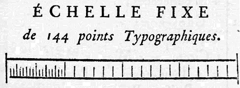
In 1723, the French government agreed that types should be subject to standards. By 1737, the younger Fournier decided to begin creating his punches to a scale of 6 ciceros or 72 points to the Paris inch, instead of the then-standard height-to-paper method. This point is smaller than the subsequent Didot point established by François-Ambroise Didot 38 years later, as Fournier used the Paris foot (0.298 m) and Didot used the royal foot (pied du roi, 0.325 m). The Fournier cicero (12 points) is approximately 11 Didot points.[4][5]

Two years after developing the point system, Fournier decided to create his own type foundry.
When the Netherlands was seized by France, Louis XIV commissioned new types for use during his reign. The King kept the font as a monopoly to himself, with penalties against unauthorized reproduction. In the following century, Fournier's Modèles des Caractères (1742; spelled by him as Modéles des Caracteres) continued the Romain du Roi style, but adapted it for his own new age. The typefaces that Fournier and successors created had such extreme contrast between thick and thin strokes, that there was a constant risk of the letters shattering.
Upon publishing Modèles des Caractères, filled with rococo and fleurons, Fournier's publication helped revive the 16th century concept of type ornaments. The revival spawned imitations, including some by Johann Michael Fleischmann and J. Enschedé.
By the 1750s, Fournier was still riding high as a major player in the industry. Fournier acted as advisor to Sweden and Sardinia in the creation of their royal printing works, and helped Madame de Pompadour establish her own printing works.
On his wave of relative success, Fournier's interest in music had a chance to finally flourish. Working with J. G. I. Breitkopf in 1756, Fournier developed a new musical typestyle that made the notes round, more elegant, and easier to read. They quickly gained popularity in the music world. Ballard had previously had a monopoly in the printing of music, using comparatively crude methods.[citation needed]
Patenting his invention in 1762, he surprisingly was frowned upon by other printers, who initially didn't recognise the practice as legitimate. He published a historical and critical treatise on the origins and process of cast iron characters for music, in which he pleaded for acceptance of his own works, while blasting Ballard.
In 1764 and 1768 Fournier published "Manuel Typographique", his formal and systematic exposition on the history of French types and printing, and on type founding in all its details; including the measurement of type by the point system.
After death
[edit]Fournier's company remained open until the 19th century.
Interest in type design was stimulated in 1922 by D. B. Updike's Printing Types. This led to the newly appointed advisor to the Monotype Corporation, Stanley Morison, initiating a program of recutting past faces. Among them was Fournier's self-named font.
Fournier on others' type
[edit]"[Baskerville's italic is] the best found in any type-foundry in Europe." John Baskerville taught calligraphy for four years, before discovering type. Both Fournier and Baskerville's italics originated with copperplate hand.
Notes
[edit]- ^ "Pierre Simon Fournier le jeune « MyFonts".
- ^ "Pierre-Simon Fournier". Encyclopædia Britannica.
- ^ Emily Byrd. "Fournier le Jeune".
- ^ Ronner, L. (1915). Van Leerling tot Zetter: Met een Hoofdstuk over het Drukken (in Dutch). Amsterdam: N. V. Drukkerij de Nieuwe Tijd. p. 30. OCLC 65484295.
- ^ Elliott, R. C. (1933). "The development if the 'point' unit of type measurement". Monotype Recorder. 30 (241). London: The Monotype Corporation. OCLC 11494675.
Further reading
[edit]- Fournier, Pierre Simon, Traité historique et critique [...]. Minkoff Reprint, Genève 1972 [avec le traité des Gando]
- Lepreux G., Gallia typographica, série parisienne. Paris 1911
- Beaujon P., Pierre Simon Fournier 1712–1768, and 18th century French Typography. London 1926
- Carter H. (éditeur), Fournier on Typefounding. London 1930 [traduction de P.-S. Fournier, «Manuel typographique» Paris 1764–1768
- Hutt, A. (1972). Fournier the Compleat Typographer. London.
{{cite book}}: CS1 maint: location missing publisher (link) - Gando, N.; Gando, F. (1766). Observations sur le Traité historique et critique de Monsieur Fournier le jeune sur l'origine et les progrès des caractères de fonte pour l'impression de la musique. Berne.
- Steinberg, S. H. (1996). Five Hundred Years of Printing (New ed.). New Castle, Delaware: Oak Knoll Press. ISBN 1884718191.
- Warszawski, Jean-Marc (February 6, 2005). "Pierre Simon Fournier". Musicologie (in French).
